Tuesday, June 30, 2009

A Package Deal

As I have said many times I am a sucker for marketing and good packaging. When Sephora puts together their sampler packages it is all I can do not to spend $100 on multiple trial sized beauty products. Here are some they have now.Above is the Get Pink'd Pink Lip Deluxe Sampler and below is the Skin Saviors Moisturizers Deluxe Sample Kit.


Above-Eau Girl Deluxe Fragrance Sampler Below (a great summer gift)- Splashstash Waterproof Deluxe Sampler

I think I love these because it brings me back to the days when I was young and would wait to buy my 3 step Clinique system when they were having a gift bag.

All the gift bags used to be Clinique green but it looks like now they have changed that....

Am I the only one with this Clinique memory as a young teen? Who do you think has the best gift sets?

how 2 decorate for the 4th of july


from ehow here

How To Decorate For The Fourth Of July
  1. Step 1
    Versatile Patriotic Patio
    Versatile Patriotic Patio

    USE RED OR BLUE AS AN ANCHORING COLOR IN SEVERAL ROOMS.

    I find red to be a very versatile color for decorating. In the winter it matches well with Christmas decorations. In the summer it makes a wonderful backdrop for the fourth of July. Even Thanksgiving orange can match many tones of red. Blue works well to create a peaceful bedroom, or a seascape bathroom theme.

  2. Step 2

    PICK ACCESSORIES THAT ARE EITHER RED, WHITE, OR BLUE.

    Except for directly around the holiday you probably don't want flags flying in every room. So find more subtle ways to be patriotic in the home this summer. Candles, wall hangings, runners, and area rugs can all make a big difference in a room. Accessorize a room without creating a cluttered feel.

  3. Step 3

    DRESS UP YOUR TABLE WITH 4TH OF JULY COLORS.

    Find blue glass chargers like the one pictured here from Spode China. Buy a red table runner and offset it with blue and white plates.

  4. Step 4

    ADD A SET OF RED, WHITE, OR BLUE DECORATIVE CURTAINS

    Depending on the color palette of a room, choose one of the three colors to accent your already existing curtains. Simply add these on to the end of the rods. These can easily be removed later in the summer.

  5. Step 5

    MIX AND MATCH SOLID COLORED ITEMS RATHER THAN BUYING RED, WHITE, AND BLUE.

    Generally speaking you will achieve a classier and more subtle look by mixing the red white and blue throughout the room. For example, buy red pillows and a white throw rather than a red, white, and blue throw.

  6. Step 6

    AND ON INDEPENDENCE DAY. . .

    On the day itself, consider using even the food to create a patriotic color palette. Add a few tasteful flags around the home and you are ready to go. Decorating for the holiday slowly this way, helps you enjoy family and friends more when the holiday arrives.


I'm So Excited!!!!

I just ordered our new dining room chandelier!!! It's made from coconut beads and is half off at Anthropologie. It reminds me a bit of Nina Griscom's ($5000) branchelier:


Obviously that's a bit out of our price range... ;) When my friends gave me a gift card for my birthday, I found the coco-bead chandlier & was in love. To be honest, few people in my "real life" seem to like this chandelier, but I was hoping you design divas would "get it." ;) ;) hahaha

Anyway, I'll be posting pics when it arrives!!

xoxo,

lauren

Interior kantor (R.Direktur)


Ruang direktur juga berfungsi sebagai ruang rapat, terdiri dari 1 bh meja dan backdrop, menggunakan finishing melamic (dark brown + natural) dan duco (silver).

Interior kantor (R.Receptionist)

Ruang receptionist yang terdiri dari 1 bh meja, backdrop dan 1 bh bench.
Backdrop menggunakan finishing dark brown dan lis stainless steel, sedangkan meja receptionist menggunakan finishing melamic (dark brown + natural) dan duco (silver)

It's Almost That Time...

Since the 4th is right around the corner I thought we could take a look at some red, white and blue rooms. Who better to help with this than Coastal Living?

How cool is this floor?

I am adding this striped chair my "should be mine" file....

What I wouldn't give for a beach house.

Want to add a little patriotic color to your casa without breaking the bank? Try one of these rugs from Shades of Light.

Even better, they are both indoor/outdoor rugs.

Interior kantor (R.Staff)


Ruang staff terdiri dari 4 bh meja staff, 2 bh credensa yang berfungsi sebagai tempat penyimpanan file, 1 bh meja fax dan 1 bh bench.
Furniture menggunakan finishing melamic dan duco silver.

Interior kantor (Pantry dan lemari file)


Pantry dan lemari file terletak diruang yang sama dan
menggunakan finishing melamic yang senada.

Foyer


Partisi yang terletak diantara teras depan dan foyer dapat langsung terlihat dari luar
menggunakan finishing melamic (coffe brown).

Monday, June 29, 2009

Modern Bathroom Furniture Sets - with new color and style

Modern-Bathroom-Furniture-Sets-with-new-color-and-style
New trend bathroom furniture set always changed, This modern bathroom furniture set collection with many color and style. You can choose it, its look beautiful and elegant. Contemporary bathroom furniture sets with spring green, deep red, royal purple, black, white. Mix and match these Modern Bathroom Furniture Sets with various modular elements to bring your dream bathroom to life. You can see and choose many style bathroom furniture sets like wall-mounted and floor cabinets, cupboards, mirrors and shelves not only look great, modern minimalist storage all look clean, contemporary and elegant. Stylish modern bathroom furniture with simple minimalist elegance or elaborate fashionable funk, this modern bathroom furniture collection has got you covered. With this bathroom furniture you can get new sensation bath.

Hello Kitty House interior design

Hello-Kitty-House-interior-design
This is unique and artistic house with Hello Kitty inspiration. Suitable for the fancy girls who adore the cute cuddly cat. This lovely Hello Kitty House (Villa) located in Shanghai. Pink color domination in this hello kitty architecture. Hello Kitty House interior design look cute and elegant. Hello Kitty themed interiors and a charming exterior applied in all furniture and home accessories. The famous hello kitty bow in pink and white is spread all across the walls, the clock, the furniture and (even) the bed, all home accessories.

Contemporary furniture of Italian design,

Contemporary-furniture-of-Italian-design
Contemporary furniture of Italian design is innovation furniture suitable applied in small room interior. We can see table folded is a very compact decorative panel the folding leg let the table close completely to a three centimeters board its look beautiful. The Contemporary furniture of Italian design is wall mounted, always available there is no need to store it away. Contemporary furniture of Italian design table can be realized with different finishes. Contemporary furniture of Italian design can be laminated, lacquered or wood, it may integrates with the existing furniture. Contemporary furniture of Italian design could be painted as the wall color and really disappear or could be a decorative element with design or imaginative shapes.

Modern minimalist pool architecture

Modern-minimalist-pool-architecture
Modern minimalist pool is the architecture of this pool house is combination traditional and modern architecture of the existing house. The architecture of the pool house hovers over a 48′x20′ pool like a vessel in the water. suitable as spa and an outdoor/ indoor shower, and on the south there is a roofed veranda acting as an indoor/ outdoor dinning area with a large opening on the wall framing the landscape beyond. we can see the large area around the pool becomes a courtyard paved in travertine with steps and walls of stone. In this interior of pool available modern facilities such as a living/ entertainment room, kitchen and bar area, simple bathroom and variety of terraces and decks. This modern minimalist pool architecture can be inspired your pool.

Swedish Apartment With Scandinavian interior design

Swedish-Apartment-With-Scandinavian-interior-design
Modern Swedish Apartment With Scandinavian interior design. Its beautiful and spectacular interiors. Floral motive decorate furniture in this apartment. We can see beautiful living room and brightens up the entire theme of the house. Classic Oil paintings and superb wallpapers decorate in this room and look artistic touch it needs badly. Beautiful Chandeliers and candle sticks on the dining table, make comfortable this room. Modern and contemporary carpets spread across the floors, floral wallpapers in bedrooms and a simple kitchen call for a contrasting look. Combination colors and simplicity, make beautiful this apartment Scandinavian interior.

Tips for Taking Interior Photographs (non-technical!!)

I received a bunch of emails after my last post asking about tips for taking "after" pics of rooms, so I thought I'd share some that I've discovered over the years. (I am by NO MEANS a professional as you can tell though!! ) Since so many of us are obsessed with getting our houses looking pretty & have blogs, I figured it couldn't hurt! A lot of these might sound like no-brainers, but I really had no clue about them when I started.

1) Don't use flash. Here are a some of 'before and after' pics of our old house, where we moved just after the apartment, the townhouse. I took them when we first moved in, but some of the 'afters' are from a year or 2 later. Here are a couple of "flash" photos:

Images with flash end up being dark & cold & cheap-looking. (above & below)
Now, check out the "after" (below). It's light & airy and much better:

2) Shoot during the day when the lighting is good. (Unless you're specifically after nighttime shots like a Christmas tree at night or candles or something special like a city view.) Here is our living room when we first moved in. (With all of my lovely decor from my old apartment... eeeeeek) I didn't use flash on it even though it was taken at night: (which is good)

But check out the difference in the same room during the day: (no flash of course)
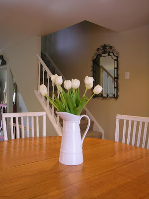
3) This one really should have been a no-brainer for me (but it wasn't!)... You should "style" the space. (ok, #1 clear out clutter... I think in the pic below that I must've just been trying to get a shot of the pretty roses from my husband -- not trying to get a room shot--- but it does illustrate this point perfectly. How can you even notice the flowers when there's junk everywhere?!)

How much prettier do these (below) look? No clutter, no flash... HUGE difference:

Some reminders for styling: ditch items like wastebaskets, newspapers... Hide your electrical cords. Tape them to the underside & down the back legs of furniture so you can't see them. Nothing is worse than a tangle of cords.

Styling for the kitchen: Sometimes people actually go too sterile when photographing kitchens. But, remember you can ditch items like your toaster (if it's not cute & takes up too much space), sponges, pot scrubbers, pens & pencils, etc. Consider having a pretty soap dish or dispenser, nice towels, good-looking cooking utensil holder, a bowl of fruit and/ or vase of flowers.


The pictures above & below are from when we sold our house so actually a few things are missing because staging is different from decorating (like the pretty towels & a few things that might warm it up) but we did set up a couple of bottes of Aquafina on the bar, which I always think looks nice. (I love Aquafina bottles & totally refill them with fresh water & stick them back in the fridge!!)

Styling for the Bedroom: Again, some fresh flowers or something pretty on the nightstands. (Even set up some colorful jewelry or books--- anything that's pretty & adds a little something)... Add interest to bedding. Think of Pottery barn and all their layers. Even just a throw at the end of the bed can do the trick.

Show personal, but not-too-personal-items that make the space look lived in: NOT the box of tissues but maybe a cool glass of water in a vintage glass or a pair of glasses on a stack of pretty books..


For living rooms, a lot of the same things apply. Use pretty pillows and interesting accessories. Get rid of any clutter that isn't attractive. Always add fresh flowers or greenery if you have time. You'd be surprised what a huge difference adding flowers/ greenery into the room does. Again, the goal is to make the space look "lived-in" but not cluttered.

Pottery Barn is awesome at styling in my opinion. I might not always be in love with what they're selling but I'm always so impressed with their styling. (above) For dining rooms, make sure there's something beautiful on the table. It doesn't necessarily have to be a set table (which does look gorgeous) but it could be something simple like a pair of lanterns or dinnerware stacked up as if it's about to be set with a little vase of fresh flowers.


Take advantage of tabletops & shelves. Every surface is a change to create something beautiful. It's important to train your eye. Scour catalogs & design magazines & notice all the details that are present & missing. You'll be surprised by how much you can learn & by how good you'll get.


4) Use a tripod or hard surface to set the camera on. I'm really guilty of not following this rule and it shows. This is huge because if you're not using flash, it's really easy for the photo to blur and any movement at all messes the photo up. (Virtually none of the photos I take myself are clear enough, probably because if this!! ok, I know what I need to go buy!!)

5) Leave out any unattractive features in the room from the shot... Depending upon the look/ mood you're going for, this could be anything from the TV, to speakers, to the chair that you just haven't had the time/ money to reupholster yet.


6) Shoot from lots of different angles & take TONS of pics. I'm not a professional photographer so I don't know which angle a shot will look best from so I take them all. This way, I get tons of photos of one room & I have my pick of which shot works best. I'm often surprised that the one I thought would work the best, doesn't. Get low, get high, go straight on... try it all. (You'll eventually get the hang of what usually works best & won't have to always take so many shots but it's good to start out this way to find out what you like. )

7) Figure out the style of photography you like & try to emulate it. There is a HUGE difference between Architectural Digest & Domino. I made the (HUGE!!!) mistake of spending $$$$s on a photographer who did work for Architectural Digest to shoot for my portfolio. His work was amazing, but totally not my style. The photos ended up looking static & serious to me, which was not how I wanted my work coming across at all. The angles were all straight on & I couldn't feel any movement in the room. I was able to use a few shots that I loved, but overall for the amount of money I spent, I was really disappointed. (They're all on my website now & it drives me CRAZY!!! arg!!) But the point is, it was my fault. I didn't have enough knowledge of the style of photography I wanted. If you can figure out what you like, you can immitate it. (country living image below)


So, there you have some info on how to get better interior shots. I know I didn't address any technical issues & that would be because I'm still clueless in that arena!!! (I have yet to read my camera's manual so that might help a bit!) Hope everyone had a great weekend!!!
xoxo,


lauren

Blog Archive