Friday, January 30, 2009

Never Underestimate the Power of Great Natural Beauty

"Never underestimate the power of great natural beauty to bring you inspiration, peace of mind, and clarity of thought.
In nature, you find yourself." 
Wayne Dyer

Wishing you a Happy Weekend 

eric piasecki photography2 eric piasecki com

image photos by Kjersti-Berg_dreaming days

Top 2 photos Eric Piasecki, Bottom Left unknown, Bottom Right Kjersti Berg

Patricia Gray writes about emerging trends, her inspirations, "What's HOT" in the world of Design, as well as sneak peaks of her work. 

"Real" vs. "Kitsch"

As you know, I'm constantly trying to define my style, hone my skills & figure out what works & what doesn't work in spaces. Well, a concept I often think about is real or authentic design, art & accessories. vs. what make something kitsch or scripted or forced or "decorated."


I used to be THE culprit of kitsch when I started out. I wanted my college apartment bedroom to feel like a conservatory, so up went a huge painting of a conservatory & palms & a whole dollar store's worth of fake flowers along with it. eesh (I've mentioned this room before & still haven't found a picture of it- my albums are in storage!)


Anyway, since kitsch is often one of the easiest & cheapest things to do and one of the most readily available, we see it a lot in real life. Picture the person who wants their house to feel like a farmhouse so they buy farmhouse dinnerware:


When instead they could do something more authentic, like this home from Country Living, below:


Using materials & details that would possibly be used in a true farmhouse make this space authentic. The cow print is a fun playful addition to the room & it's not trying to be anything more than it is. The white ironstone is appropriate & beautiful.


Or picture the person who wants a Tuscan-feeling kitchen & fills it with an unusable amount of bottles of oil in the kitchen,


or dishcloths with winebottles on them, wine bottle artwork and throw in a mass-produced Tuscan scene or two. Now I do not mean to judge here, merely to get us thinking. I have been the culprit of this many a time. I think it's a really easy way of designing to get into for the inexperienced & I've SO been there. (how do you think I can describe this room so perectly?! ;)


But the interesting thing is how to figure out how we can evolve out of it, to figure out ways to create the spaces we desire without being inauthentic. To really evolve & become better. I like this styled buffet from Pottery Barn, below. It gives the Tuscan feeling without being as obvious:


Why show a picture of a bottle of wine with no intrinsic artistic value when you can simply have a wine rack? (This isn't to say that I think art with wine in it can't be beautiful, because I've actually very recently seen some amazing art with wine bottles in it) And, why have a picture of a potted palm when you can just head to Home Depot & grab a real one? (yeah, I know, you have to keep it alive ;) And I'm not talking about botanical prints of palms (which I love & I do think of as authentic), I'm talking about the early 90s looking artwork:


If you have stuff like this home, don't feel bad. Just maybe take a minute to reevaluate it. Ask yourself if you actually love the piece or if you just picked it up because it was inexpensive & came in 4' by 3' & fit the "theme" and in the blank space above the sofa. If those are your reasons, I'd say ditch it. If you actually look at it & do love it, then work with it. Thomas Kinkade (below) is one of America's top-selling painters & his name is also one of the first that pops up when you google "kitsch art." A lot of people love his work & the happy feeling it gives them. I say that if you really love something even if it is considered inauthentic, then keep it. If you love it, it's authentic to you.


I also do think it's possible to be ok with certain aspects of kitsch. For example, check out this space in decorator Kirsten Hollister's kitchen (below image from turquoisechic.com) where she uses a bunch of kitschy little paintings of flowers & groups them together casually, irreverently & has fun with them. She's using them for the pops of color & fun they add to the room and it's not displayed as precious art:

And I totally have a thing for really cheap old paintings of landscapes, boats, people & the water. I get them for around $5- $30 & I absolutely love them. I know they're not great art and are considered kitsch, but something about them makes me happy. I think the key is to just display them casually or en masse. The way you display art says a lot about it. (Is it lit up & in a $400 frame? Then that baby better be art in your eyes!) Image below from interiordec.about.com:


Here's a $5 cheapie I love (below) that I have on my mom's mantle right now. It's just causually leaning there & it's not a permanent fixture. It doesn't speak to me in any profound way, it simply added the color & feeling I was on the mood for in the room. It's more to create atmosphere than to be gazed upon as a work of art.


On this road also comes the fabric question. There are those who say that flowers belong in vases & not on fabrics. I really do see the logic & realness to this idea, but I'm still not there yet. I still love a pretty floral on a pillow or blanket. (I'll write more on this later)


One thing I am learning through all of this is that I don't believe in absolutes when it comes to design. Make your rules, but if something comes along & doesn't jive with your rules & you're okay with that, break 'em! I just think it's important to be aware of why you're making certain decisions & to be aware of why you're breaking the rules.


("They're more like guidelines anyway." ;)

Modern Twist on Classical Designs -- Part II

Okay, I've been flooded with emails about my post yesterday.  I guess I've struck a chord that makes me realize I'm not the only one that loves modern adaptations of classical and period revival homes.  The work that some talented architects are doing simply amazes me with their incredible eye for detail, scale and proportions.  Their imagination and ability to take what they see in their head and put it on paper sometimes astounds me.  As I wrote yesterday, there are many failures in trying to do this.  However, another architect (who trained under Bobby McAlpine) is doing it very, very well.  I recently came across his work and have already become a huge fan.  His name is Ruard Veltman and his staff of Ruard Veltman Architecture in Charlotte, North Carolina.  They describe their company as "an atelier residential firm, fluent in a range of historical styles without being bound by tradition."  The designers render their drawings by hand which I love.  While I am not an architect, I do design many of the homes we build.  I have been a student of architecture for many years, drawing floor plans and rearranging furniture since I was 11 years old and I find it impossible for someone to truly put their creative imagination for a design into a computer without drawing or sketching it out first.

Here are some pictures of Ruard Veltman Architecture's work.  The first home is what he calls Jacobean Tudor:

Look at this wine storage.  Incredible.

Here is Ruard's take on a Mediterranean style:
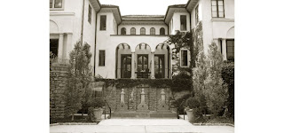

I believe the above picture is a basement level wine room.  The below pictures are of his take on an English Cottage:


Ruard is a very talented architect and I'm looking forward to seeing more of his work.  If you know of any architects doing similar work, please forward their information to me.


Thursday, January 29, 2009

Beige is Magic - Albert Hadley

"Beige is atmosphere. It's bisque, it's ivory, it's cream, it's stone, it's toast, it's cappuccino. It's, well, it's magic." Albert Hadley

Enjoy the slide show!!


Patricia Gray writes about 'WHAT'S HOT 'in the world of Interior Design, new and emerging trends, modern design,
architecture, and travel, as well as how your surroundings can influence the world around you.
© Patricia Gray Interior Design Blog, 2009


The Washington Post Santa!!

I wanted to thank Terri Sapienza so much for putting Pure Style Home on Blogwatch today in the Washington Post!! (For the recent post on my client's dressing room, 2 posts down.)

I was just sitting down for breakfast & opened up the Home Section to Blogwatch & was so shocked to see it on there!!! I started yelling because I was so excited & totally freaked my husband out because he thought something had happened with the baby. oops!

Anyway, it's like Christmas morning for design bloggers & Terri, thank you so much for being Santa! (Do you know how exciting this is for us?!!) I really appreciate it & can't tell you how great it was to call my grandparents & have them open up the paper to H2. ;)
ps- my dad read this post & was like, "I think you should tone down your excitement." Come on dad, do you know me?!!

Modern Twist on Classical Designs

Modern adaptations of classical architecture have their place.  It is very easy to completely destroy what started out as a great design.  I see it all the time on additions to old houses.

However, when done right and an architect puts his spin on period revival architecture the outcome can be outstanding.  One of the best I know of for doing this is Bobby McAlpine and his partner Greg Tankersley of McAlpine Tankersley.  They describe their work as "nurturing, compassionate, soulful," the firm's architecture, wedding historical precedence with graceful modern living, is a timeless and romantic pursuit of "The Inheritable House".

And do they ever.  What is even more amazing is that their firm is headquartered in little Montgomery, Alabama.  You know how us Southerners (I'm from Baton Rouge) love great architecture.  Below are some pictures of their work.  These pictures came from both Southern Accents and Veranda.


The picture above and directly below are of Bobby McAlpine's house he built in Montgomery quite a few years ago.  He has since sold it and restored another house.


The three pictures above are of a house I saw when I was visiting family in Memphis and taking my early morning architecture drive (I do this in every city I visit).  At the time, I didn't know it was a McAlpine-Tankersley house but it caught my eye from 500' away.

The next two pictures are of Greg Tankersley's personal house.


I'll do more posts on modern adaptations of period revival homes and the architects who are doing great work.


Blog Archive