Decorating a pumpkin with buttons can look cute, and you can save the buttons to use the next year. Choose buttons of assorted size that are in fall colors, you probably even have enough buttons around the house for this if you do any sewing. You can either hot glue the buttons onto the pumpkin, or you can thread wire through the button holes and spear the wire into the pumpkin. You can go for a random look, or you can arrange the buttons into a face.
There are lots of types of wrapped candy that comes in Halloween style wrappers. Buy an assortment of this type of candy, and simply staple the ends of the wrappers together to make a long garland for decorating. These can look very cute wound around stair railings, displayed on tables, or displayed on mantles.
Spray painting pumpkins with metallic paint can look fun and different. If you want to make these pumpkins even more dazzling, try sprinkling glitter or confetti onto the pumpkins when the paint is still wet. After the paint is totally dry, use a black marker to draw on faces. Display as a table centerpiece with orange candy next to it in clear jars. Replacing the lights on your porch with orange bulbs can give your porch a festive feel, especially if you display lots of lit pumpkins on the porch too.
I hope these ideas help with your Halloween decorating this year!
It is already time to start decorating for Halloween! Here are some fun crafts you can make for a very low cost to decorate your house.
Buy three small pumpkins of increasing size. Clip the stems off of the two larger pumpkins. Find a decorative vase with a mouth wide enough to set the largest pumpkin in. Next, stack the two smaller pumpkins on top, with the smallest pumpkin on top. You can also place fall leaves between the pumpkins.
A large bowl of small pumpkins with fresh leaves and berries added into the mix can look very nice as a centerpiece. If you fill the bowl halfway with water before putting the items in, you can keep pieces of leaves and vines alive for awhile in the water. If you want to go more simple, don’t add water and use pressed fall leaves instead of fresh leaves.
It can look very cute to cut a hole in the top of a medium sized pumpkin, remove the pulp, and fill it with water to use as a vase. Use your pumpkin vase to display fall colored flowers. Chocolate oranges can serve as a treat and as a decoration. Just cut pieces of black electrical tape into triangles or other shapes to make pumpkin eyes, noses, and mouths. Then, roll electrical tape into a thick piece to use as a stem to put on top of the chocolate orange. Display them until Halloween is over, then enjoy them as treats!
Bottled lemon-line and orange soda can be turned into Halloween decorations in just a few minutes. You can simply use a black marker to draw pumpkin faces on them, or other scary faces.
If you want a plant that can survive for up to a year without watering try the Ponytail Palm. This amazing plant won't tolerate being watered unless the soil has completely dried out first. This plant does require lots of light, and even does well in direct light. This palm has a thick trunk with lots of long ribbon like leaves growing out of it, it looks a little bit like, just as the name suggests, a ponytail.
Amaryllis is especially pretty in yellow, called golden goddess. The flowers are a soft yellow color and trumpet shaped. The flowers are huge, they can be up to seven inches wide on 20 inch stems. This flower is grown from a bulb. This plant likes bright indirect light and should be watered infrequently, only when soil dries out. It grows to a height of 20 inches. It should be planted in early to late winter.
Aspidistra are very low maintenance. In fact, they have the nick name the “cast iron plant” because they are so tough. This plant has tall wide leaves that taper off at the ends. This plant will tolerate wet soil, drought, extremely dim light, and temperatures as cold as 28 degrees. Boston Ferns do well in a humid bathroom. They have lots of frilly light green leaves that hang down below the pot, and for this reason they look wonderful hanging. They need indirect light to do really well, although they will survive in dim locations too.
Pothos vine is another very popular houseplant. It likes bright but indirect light. It will tolerate direct light, but the leaves won’t look at pretty. These plants are every easy to maintain. It is best to keep the soil moist. This plant does well as a hanging plant, because the vine will grow quite long and look nice.
Plants can really bring life into a room. They look great and can be very easy to maintain. The trick is knowing which ones are easy to maintain so you don't have to put much time into them.
Cacti can be wonderful for decorating. They require almost no attention and they look quite interesting. They can be purchased in pots with several types for a varied look. Cacti do like bright light and won't do well in a dark area. They do well and look great in windowsills. They should not be watered very often.
Chamaedorea Palms are elegant and exotic looking. They can grow up to six feet tall and really add a tropical look to your home. They do like bright indirect light and won't do well if they don't get it. They don't need a lot of water; they should be watered only when the soil gets very dry. These plants look perfect as accent pieces in corners.
Chinese evergreens are a plant that likes low light. They can even survive with just a reading light. The leaves are a beautiful silver gray mixed with dark green. The soil needs to dry out totally between waterings. This plant likes warm areas and won't do well if the temperature is below 45 degrees. Braided Ficus Trees are very popular for indoor use. The leaves are dark green and the stems twine together in a pretty way. They are several feet tall, so they can really be a nice decorating piece. These trees do well with low light or bright indirect light. The soil should be kept moist.
Repainting cabinet doors can make them look much better. You can also add some simple wood trim to flat cabinet doors to change their style. These are easy fixes that shouldn't take you more than a weekend, and they are also very inexpensive.
You will need 1/4 inch MDF, woodfiller, fine sandpaper, paint and a paintbrush, a screwdriver, a tape measure, a hammer, a nail punch, and a scraper.
First, take the cabinet doors off of the cabinets using a screwdriver. Remove the handles from the cabinet doors next. Now measure the cabinet doors so you'll know what size your MDF needs to be. You will want the MDF to border the cabinet doors in approximately two inch strips, but you may want more or less depending on what looks right with the size of your cabinet doors or drawer faces. You want two strips of MDF to run vertically on each side of the door all the way from top to bottom. Then, you want two strips to run horizontally at the top and bottom between the two vertical strips. You may want to take the trips to be cut by an expert, so you can get the precise cuts that you will need. Attach the MDF to the front of the cabinet doors with panel pins and a hammer. Use woodfiller to cover the holes when you're done. After the woodfiller is dry, sand the surface until smooth.
Now you are ready to paint the cabinet doors. You will probably need two coats of paint. After they are dry, reattach the handles and hang the doors again.
If you don't have flat cabinets to begin with, you can still paint your cabinets and refresh them. You can paint the inner panel a different color than the outer trim and paint the kitchen walls to match the inner color. This can look pretty cool.
This is a simple project that will not take long. It will add Fall spirit to your home, and you can use it year after year.
First, you need a frame. This part is totally up to you. Choose a frame that matches the other frames in the room where you want to display this decoration.
Next, you need some colored paper to put inside the frame. It can look cool to select paper that is the exact same color as your wall. If you do this, it will give the illusion of the leaves and writing (this will make sense soon) being in between layers of glass. I like this look, I think it makes the decoration look more expensive.
Now, print a message on the paper, leaving at least 3/4 of the paper free for fall leaves. The message can be as simple as "welcome", an inspirational quote you like, or anything else really. You can use your computer and printer if you want, or you can hand write or paint the message.
The last step is to take some bright Fall leaves and glue or tape them to the paper. The arrangement of the leaves is up to you. When you're done insert the paper into the frame and your project is now complete.
You can prop the frame on an entry table or coffee table, hang it on the front door, set it on an easel, or hang it on the wall. Remember to use it next year too!
Decorating with white is very easy. It is hard to go wrong when decorating with white. The only risk you take is that your home will look boring. You definitely won't have people looking at your home thinking that you made awful choices.
The color white makes most people think of purity. White is also the color of winter of course, and it can make people think of snow in nature. White is a bright color that makes rooms look larger. It is great to use white in a room that is too dark, white does a good job of making rooms feel brighter.
It can be nice to decorate with white because it can be used with any other color. White makes other colors seem to stand out. Too much white in an already bright room can be overbearing. Too much white can also seem clinical, and lack personality. White and blue is a common color theme seen in kitchens. This color combination looks very fresh and clean. Several different shades of white can be used together to add depth and interest, this can been a very bright and cozy look. White can be used easily with brighter shades of color if you want to go with a bolder look. Often, people who are renting their homes are stuck with white walls. These people can make their homes look much brighter just with the use of colorful furniture or accent pieces. This can create a modern look.
A room needn't have a total makeover to make a statement with black - punctuate a neutral interior with a sleek black table lamp.
A TOUCH OF BLACK in a room can act like a punctuation mark!
This gourd lamp with black silk oval shade is from the stylish Porta Romana lamp company in the UK and is a timeless classic.
The Night Hotel (pictures above and below) in New York is a study in black and is decorated in "Modern Gothic Gotham"
A bold black stripe down the back and seat of these mid-century chairs creates added interest. Popham Design
Black & White photos line the walls of this stairwell, and the black geometric "David Hicks" inspired carpet adds drama and lots of glamour. Eric Cohler
Hollywood Glam - black patent headboard & bench - InStyle
The black marble floor is another timeless classic (left) Jamie Haydon / Kitchen with black slate floor (right)
Black & white dishes (left) / an iconic Chanel tray (right). When I think of Chanel, I think Black, I think timeless, I think classic, I think unforgettable!
Timeless black sofas add drama and are a grounding element in the above rooms. (left) Mary McGee / (right) Suzanne Kasler
Want to add drama to a room quickly and inexpensively, try painting or wallpapering a feature wall black.
Paint your house black. My favourite black paint is Benjamin Moore Black Beauty - photo NY Times
Black can act as a neutral because there is no color it doesn't go with.
Accessorize with these buffalo horns from Z Gallerie
Black can be a tricky color to decorate with. You want to make sure not to go overboard, or you’ll end up making your home look gothic. But, using a little black can really add emphasis to certain areas of a room, and depth to others.
The color black can look very sophisticated. Black is thought to be a stabilizing and strengthening color. It is said to make people feel more authoritative and powerful.
Black works as an accent color for almost any other color. Black can really be used anywhere, it just needs to be used in moderation. Black is an easy accent color to use. Furniture that is black is an easy way to incorporate this color into your decorating. The color black makes other colors look more striking. It is not a very good wall color, even for just an accent wall. Black looks good with almost any other color, but the safest combination is probably black and tan. This combination looks classic and it will never go out of style. The nice thing about this color scheme is you can add accent pillows and a few other accent pieces that you can easily switch out with others seasonally, or just on a whim. If you want to go with a bold look, that is very easy to achieve when decorating with black. Black and red can look very striking together, but just be sure to use another neutral color too, so that your theme doesn’t look too dark. I really like black when it is used with a light to medium green. For instance, green walls with black a chair rail and trim would look nice. You wouldn’t want to go with this color scheme in a room without much light though.
Decorating with shades of brown and tan is very safe and has a classy look. It is probably easier to decorate with brown tones than with any other colors. If you don't like to take risks with your decorating, brown would be a good color to start with.
Brown is a warm color that makes people feel safe and comfortable. Brown is neutral and won't clash with other colors, which makes is very easy to use. Brown is of course a very natural color, which humans have been surrounded by in nature for ages. Brown is classic and will always look good, no matter what other trends are happening. If you want to use brown shades, but you want your theme to have a little more interest, make sure you use varying shades of brown to offer contrast. Chocolate brown looks great with light tan for example. Make sure you don't use too much dark brown unless the room you are decorating is well lit. If there is not very good lighting in a room, try painting the walls a light tan, and use dark brown for your accent pieces.
If you want to use brown shades with other colors there are several combinations that look beautiful. Blue looks very nice with brown, it is a very classic color combination that it is hard to go wrong with. Yellow can look very natural and nice with brown. This combination looks very warm and inviting. Red looks great with brown too for a more exciting look.
Green is an easy color to decorate with. It is a color that most people don’t mind, which makes sense, because green is a very dominant color in nature. Green is a refreshing color. Most people associate spring and the refreshing optimistic feelings they have when thinking about spring, with the color green. This is a color that can be used almost anywhere in your home. Men and women seem to like green color schemes in the home equally well.
Temporary touches of green can easily be added to the home simply by displaying green grapes or apples. Flowers are another great temporary display of green that will look beautiful in your home.
When used with white green looks very refreshing and spring like. Purple or yellow accents can also be used with green for a fresh spring effect. Olive green and black used together can create a dramatic and elegant look that is beautiful. Really, green can be used in any room and in almost any quantity. If you use a light colored earthy green you can easily paint all of the walls in a large room without being overwhelmed with the color.
Be careful not to use too much dark green in a space without good lighting or in a room that is too small. Green, like any dark color, can cause a room to look smaller and darker.
Purple is generally a feminine color that isn’t used too frequently. Purple is a comforting and relaxing color. Purple is also known to be a spiritual color. Purple is an artistic color that has been said to spark creative ideas and feelings.
Purple is said to be both a warm and a cool color depending on the colors that are around it. Purple paired with yellow will seem cool, while purple paired with green will seem warm.
I like purple best when it is paired with green. The combination reminds me of grape vines and summer time. The combination of purple and green is commonly seen in Italian themed kitchens decorated with stenciled grape vines and bottles of wine displayed. Purple is a fairly versatile color because it can be paired with several different colors and provide a different feel with each. Purple combined with white can look fresh and romantic. Purple combined with tan and light yellows can look elegant and classy. Purple combined with pastel yellow can look child-like.
Because of its versatility purple can be fun to decorate with. However, purple seems to be a color that not everyone likes. It might not be too popular in a space that men are going to be frequenting for example. But even among women purple is not always very popular. It is best to be careful when you use purple. Make sure that the people who spend the most time in the space you are going to decorate with purple like the color.
Blue is one of the easiest colors to decorate with. Blue will appeal to a wide range of people because it is a calm and relaxing color. Blue isn’t too demanding, it is soothing and refreshing. In nature a large portion of what you see is blue, because the whole sky is often blue. Water is also blue of course, and so it is a great color when you want a beach theme. The color blue probably appeals to such a wide range of people because it is seen so much in nature. You may not want to use blue if you live in a very cold place, because blue can cool a room down. You also may not want to use blue if you are decorating a room without very much natural light, such as a basement room, because blue can feel depressing and gloomy without light to complement it. Blue has been known to suppress appetite, so it is not a great color to use in a kitchen. This could well be because in nature blue is not a food color very often, and some blue berries are dangerous to eat.
Blue and white used together will look very fresh and clean. Dark blue has a masculine feel, and can be used to decorate men’s bedrooms or studies. Blue and yellow complement each other very well are great to use together in a space.
Blue is a very common color to use in bathroom decorating, because it reminds us of water.
Pink is the most feminine color. Decorating with pink can be risky, because it usually only appeals to women, and there are even many women who it doesn’t appeal to. It is best to only use a lot of pink in decorating a room for someone who loves pink and who will be the only person to spend a lot of time in that room.
Pink is a warm, romantic and comfortable color. This color can actually calm a person who is angry. Pink even has been known to affect how food tastes, making things taste sweeter. Many people associate pink with flowers or childhood. Bedrooms can look wonderful with a pink theme. Pink is a popular color for little girl’s bedrooms. Bathrooms can also look great decorated in pink. Pink actually complements most people’s skin tones. Pink can be a lot of fun to decorate with, because it is playful color, especially when using splashes of hot pink. If you want to use pink, but you want to be careful not to go overboard, consider painting an accent wall pink, or accenting a room with a cute piece of pink furniture, such as a chair.
Pink can also be used to decorate your yard. Lots of flowers come in pink and can be planted in your flower beds or in planters and pots to be displayed on your porch.
Yellow can he a challenging color to decorate with because it can be so bright and demanding. Many people aren’t sure how to use yellow. However, there are many shades of yellow that are not as bold that can be used. Also, yellow can be used in faux painting with neutral colors that will take down the brightness a few notches.
Yellow makes people feel cheerful and warm. It is an overall happy color and a color with energy. Most people think yellow when they think of a cheerful color, after all, it is the color of the sun. It is great to use yellow and other warm colors in your home if you live in a cool climate and you want to make your house feel warmer and cozier. You might not want to use yellow if you live in a hot climate though, because your home may feel too warm. Too much yellow can make some people feel anxious.
Kitchens are probably the most popular place to use yellow. Yellow can be either a very safe color to decorate in or a risky color depending on the shade you use. The brightest yellows should be used carefully, perhaps only to paint an accent wall. However, soft yellow shades are easy to use and can be used almost anywhere in your home. Yellow combined with white is a classic color scheme that is very safe and almost fail proof. Yellow combined with dark red is a bolder scheme that can look very good.
November 5, 2008 Here are the statistics of the Poll
Patricia Gray writes about Interior Design inspirations, emerging trends, and the world of Design. While you're here, subscribe to this feed so you don't miss out.
The color orange often makes people feel cheerful. Orange is a warm cozy color that is also strong and can be energizing. Orange is known to stimulate hunger and also to spark conversation.
When you think of orange in nature often fire, autumn, and pumpkins come to mind. These are all positive associations for most people. Since orange is one of the main colors used in Fall decorating, now is a great and easy time to use orange. Orange can easily be used in the fall just by displaying pumpkins and leaves around your home.
Because the color makes people feel hungry, it is a popular color for kitchens. Use orange for your plates if you want to encourage more eating. If you don't want to feel as hungry in the kitchen, you would want to steer clear of orange and red. If you live in a warm climate you would also want to limit the use of orange, because it will just make your home feel warmer. Orange can really be a wonderful color to use if you live in a cold climate, it can add a lot of warmth and coziness to a home. Orange can be a fun color at first, but it can be hard to live with long term for some people, especially if bright shades of orange are used. You may want to think carefully before investing too much time or money in an orange color scheme. However, there are plenty of earthy orange shades that are easier to live with.
 Replacing the lights on your porch with orange bulbs can give your porch a festive feel, especially if you display lots of lit pumpkins on the porch too.
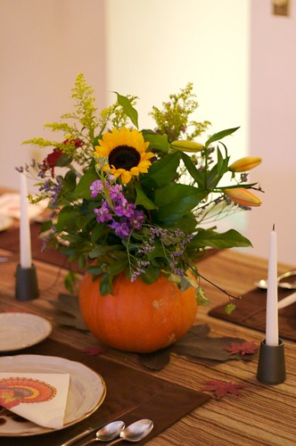 Chocolate oranges can serve as a treat and as a decoration. Just cut pieces of black electrical tape into triangles or other shapes to make pumpkin eyes, noses, and mouths. Then, roll electrical tape into a thick piece to use as a stem to put on top of the chocolate orange. Display them until Halloween is over, then enjoy them as treats!
 Boston Ferns do well in a humid bathroom. They have lots of frilly light green leaves that hang down below the pot, and for this reason they look wonderful hanging. They need indirect light to do really well, although they will survive in dim locations too.
 Braided Ficus Trees are very popular for indoor use. The leaves are dark green and the stems twine together in a pretty way. They are several feet tall, so they can really be a nice decorating piece. These trees do well with low light or bright indirect light. The soil should be kept moist.

 White and blue is a common color theme seen in kitchens. This color combination looks very fresh and clean. Several different shades of white can be used together to add depth and interest, this can been a very bright and cozy look. White can be used easily with brighter shades of color if you want to go with a bolder look. Often, people who are renting their homes are stuck with white walls. These people can make their homes look much brighter just with the use of colorful furniture or accent pieces. This can create a modern look.


 Black looks good with almost any other color, but the safest combination is probably black and tan. This combination looks classic and it will never go out of style. The nice thing about this color scheme is you can add accent pillows and a few other accent pieces that you can easily switch out with others seasonally, or just on a whim. If you want to go with a bold look, that is very easy to achieve when decorating with black. Black and red can look very striking together, but just be sure to use another neutral color too, so that your theme
  If you want to use brown shades, but you want your theme to have a little more interest, make sure you use varying shades of brown to offer contrast. Chocolate brown looks great with light tan for example. Make sure you don't use too much dark brown unless the room you are decorating is well lit. If there is not very good lighting in a room, try painting the walls a light tan, and use dark brown for your accent pieces.
 Really, green can be used in any room and in almost any quantity. If you use a light colored earthy green you can easily paint all of the walls in a large room without being overwhelmed with the color.
 The combination reminds me of grape vines and summer time. The combination of purple and green is commonly seen in Italian themed kitchens decorated with stenciled grape vines and bottles of wine displayed. Purple is a fairly versatile color because it can be paired with several different colors and provide a different feel with each. Purple combined with white can look fresh and romantic. Purple combined with tan and light yellows can look elegant and classy. Purple combined with pastel yellow can look child-like.
 You may not want to use blue if you live in a very cold place, because blue can cool a room down. You also may not want to use blue if you are decorating a room without very much natural light, such as a basement room, because blue can feel depressing and gloomy without light to complement it. Blue has been known to suppress appetite, so it is not a great color to use in a kitchen. This could well be because in nature blue is not a food color very often, and some blue berries are dangerous to eat.
 Bedrooms can look wonderful with a pink theme. Pink is a popular color for little girl’s bedrooms. Bathrooms can also look great decorated in pink. Pink actually complements most people’s skin tones. Pink can be a lot of fun to decorate with, because it is playful color, especially when using splashes of hot pink. If you want to use pink, but you want to be careful not to go overboard, consider painting an accent wall pink, or accenting a room with a cute piece of pink furniture, such as a chair.
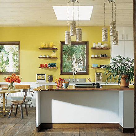 It is great to use yellow and other warm colors in your home if you live in a cool climate and you want to make your house feel warmer and cozier. You might not want to use yellow if you live in a hot climate though, because your home may feel too warm. Too much yellow can make some people feel anxious.

 Orange can be a fun color at first, but it can be hard to live with long term for some people, especially if bright shades of orange are used. You may want to think carefully before investing too much time or money in an orange color scheme. However, there are plenty of earthy orange shades that are easier to live with.